Myo Gesture: Testing Summary
For the past three month I have been working with the Myo arm band and testing it’s control. The past two weeks I got to test a series of tasks I created on people and measure the success of their attempts. So far, I have only tested on 8 different people, but there are definitely some trends already appearing. You can find the tasks online here. They were created using HTML, CSS, JS, and Myo.js. The task test click button, scrolling, and dragging. They also have two “warm-up” tasks that have the participant hit a box in each corner of the page and then draw their name using the Myo. This way the participants get a feel for the sensitivity and reaching for the interface’s boundaries. These tasks were then completed three times total by each participant on a small, medium, and large screen. The small screen was a simulated iPhone 6 Plus, medium was a 13” Macbook, and the large was a projected screens. The ordered the participants tested on was randomize as well. Here are the combinations used:
- Small-Medium-Large
- M-L-S
- M-S-L
- L-M-S
- L-S-M
- S-M-L
- S-L-M
- L-S-M
##Gesture Tasks
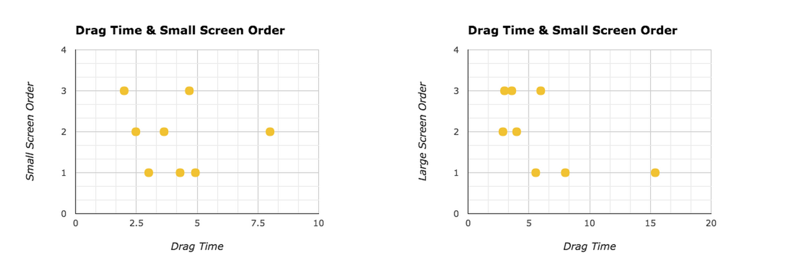
###It gets easier (slightly) There is definitely a learning curve with the Myo armband. Participants were doing slightly better (sometimes) on their third trial. But the order was randomize to help make up for this. The tables below show this on the small & large tests for the drag task. Participants on their third run did the task slightly faster.

###Smaller screens preferred The smaller screens were preferred over that large projector screens. We asked, 4/8 participants voted that they preferred the iPhone screens. It was seen as “more forgiving.” There was less shake of the mouse size the Myo moved the the mouse controlled a smaller amount of pixels when the arms moved (since the screen had a small amount of pixels). On the large screen, the sensitivity seemed increased or higher since small movements were more noticeable. From this we can gather to start sensitivity lower on large screens to help mimic this effect that happens on small screen. This was not because of order either. Three participants who voted small had it second in order and one had it third.

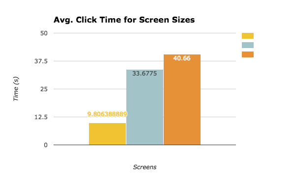
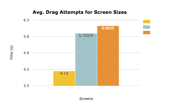
###Participants did better on smaller screens Besides preference, the participants did better on the smaller screens. Their run-throughs were faster and more accurate.


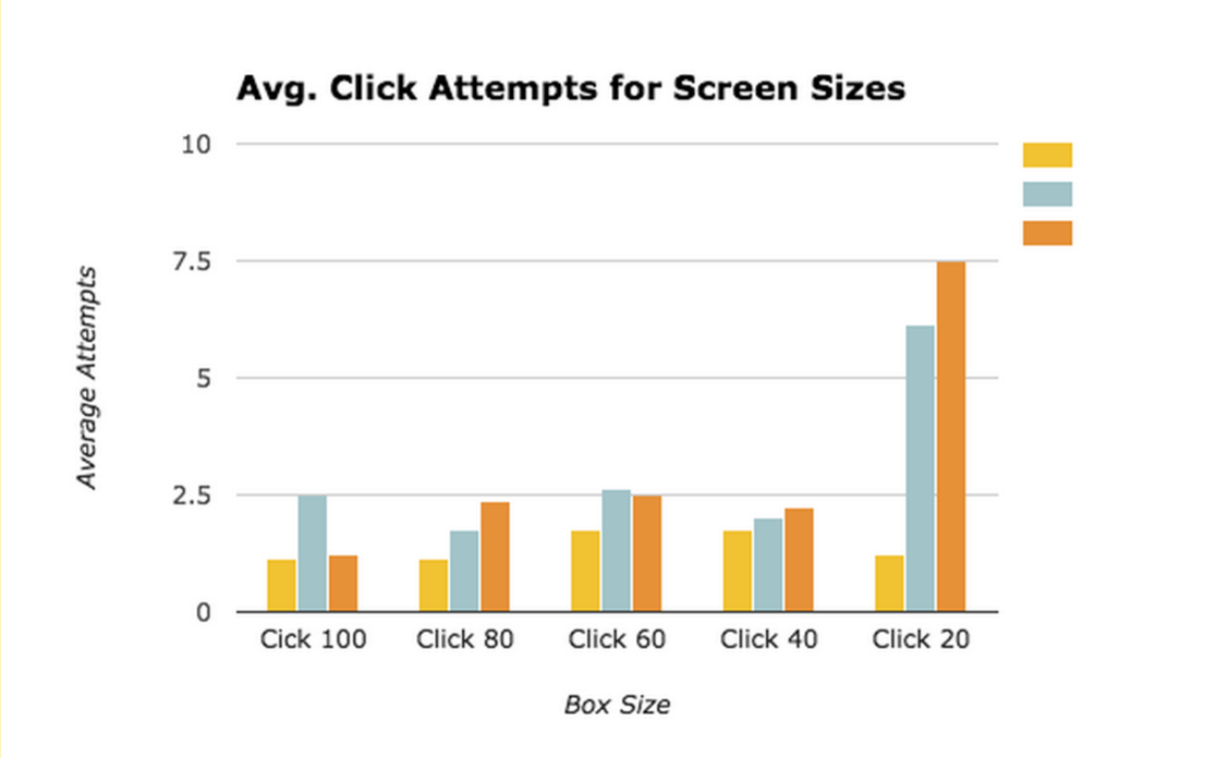
###Buttons should be 60px or larger (in general) The click task uncovered that buttons on gesture controlled interfaces should be at least 60px or large. The larger the screen, the bigger the buttons should be. Large projector screens should have buttons at least 80px big. The 20x20 px box was almost like torture for some of the participants.

###Fist gesture “jumps” when executed Buttons do not only have to be increased in size because the Myo’s sensitivity, but because gestures can make a cursor jump. Making gestures moves your arm slightly and this can move the participants selection. Larger buttons can help account for this.
###Dragging task was easiest One-hundred precent of all participants said that the dragging task was easiest. Some said that it was borderline fun. Clicking requires a steady arm to execute a function. Dragging to a general spot was a lot easier.
##Conventions
###People mimic icons when clueless I asked participants how the would use the myo to refresh, undo, or redo on an interface. Most of the participants mirrored an icon that shows this. Refresh would be make a circle while redo and undo would mimic the icons we see standard in UIs today.
###People are lazy and only move hand most of the time Some people barely moved their arms and would rest their elbow on the table. Most people used just their fingers to complete commands like they were actually touching the screens.
###Zoom commands are pretty universal The only commands that were almost identical were for zooming. People would pinch-out to zoom in and reverse for zooming out.
Next, I will be continuing testing the Myo but with more people.